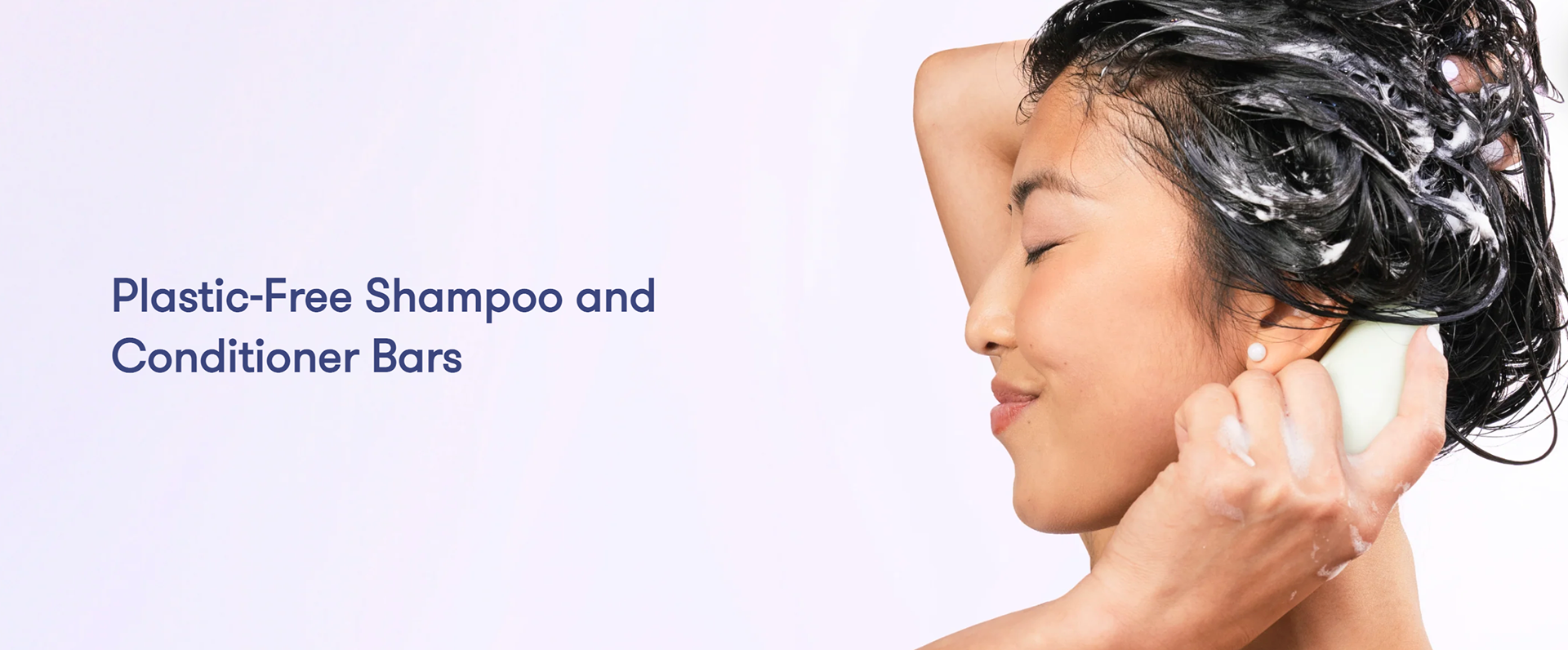
Hibar is a sustainable company that produces soap for hair, body, and face, with a strong commitment to avoiding plastic. In this concept design, I aimed to transform their original logo into something more unique and visually appealing for the brand.
blank text here
In my brand research, I noticed a clean and pastel color palette. Additionally, the soap bar's unique shape is prominently featured on the packaging. According to their website, this distinctive shape fits comfortably in your hand, making it easy to apply. Since this is a key aspect of their branding, I decided to incorporate the shape to highlight its significance.
b


This is the original logo that inspired the rebrand. I thought it would be good to bring more energy and fun into the logo.
b
I started with some sketches, I wanted to find a way to incorporate the shape of the bar with the text, as well as trying out ideas to personify the shape.
b
I decided to use a clean and rounded typography that complements the simple shape of the soap. Additionally, I wanted to create characters that represent different hair types, showcasing the specific styles that the soap caters to.
b