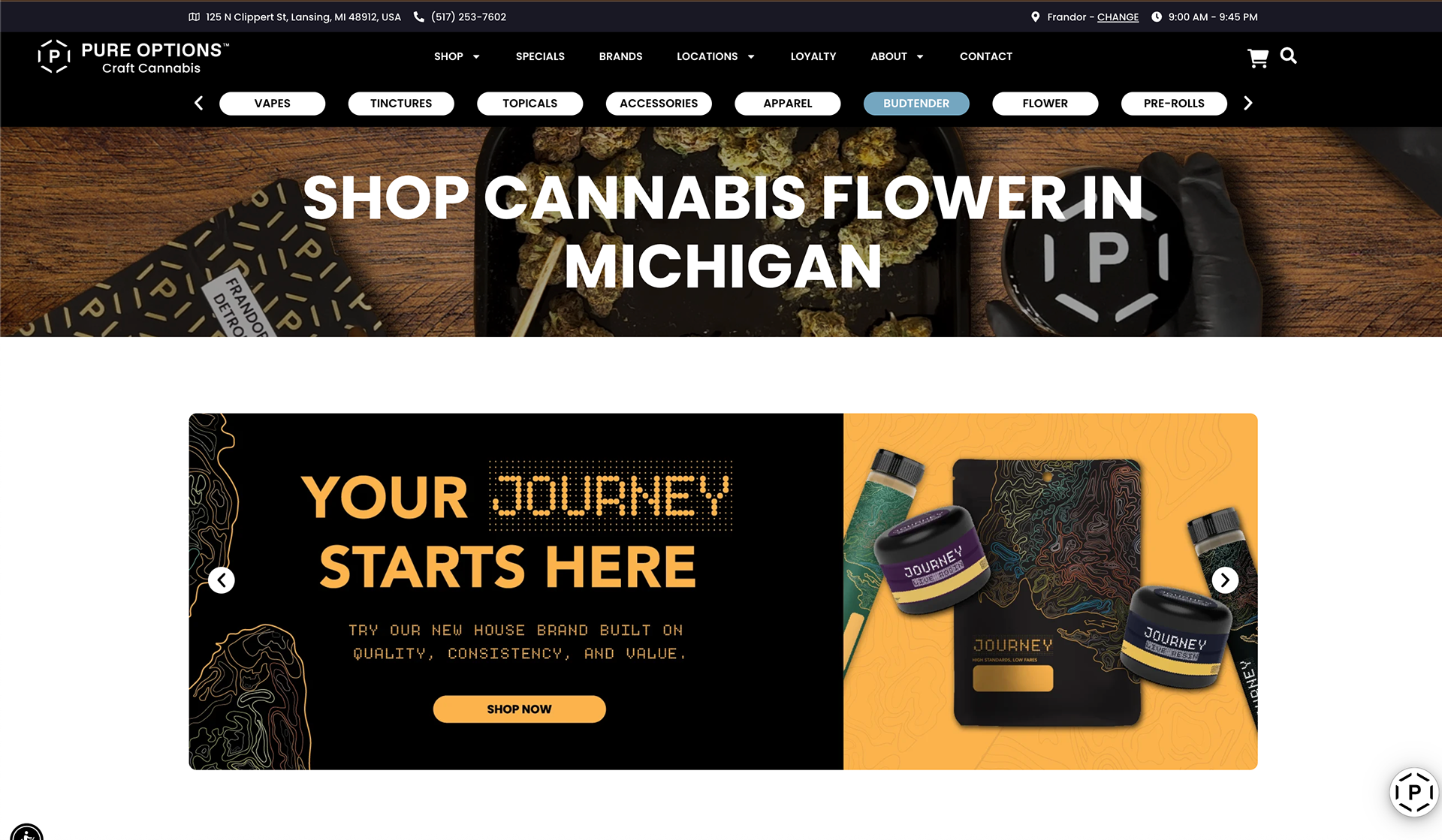
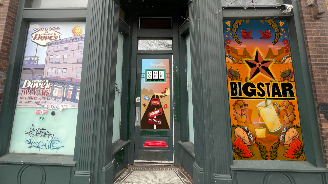
Pure Options wanted to create a house brand to offer a lower-priced yet high-quality cannabis option to compete with name-brand companies. The challenge for this project was to design a brand that stood out from the noise and helped customers feel confident in their choice. We needed to build trust and personality for our brand. We wanted something sold wholesale to our store and branded under its own name, outside the Pure Options name.
The persona for our new brand was a cannabis user who enjoys traveling in the Michigan area and is still looking for a quality product.
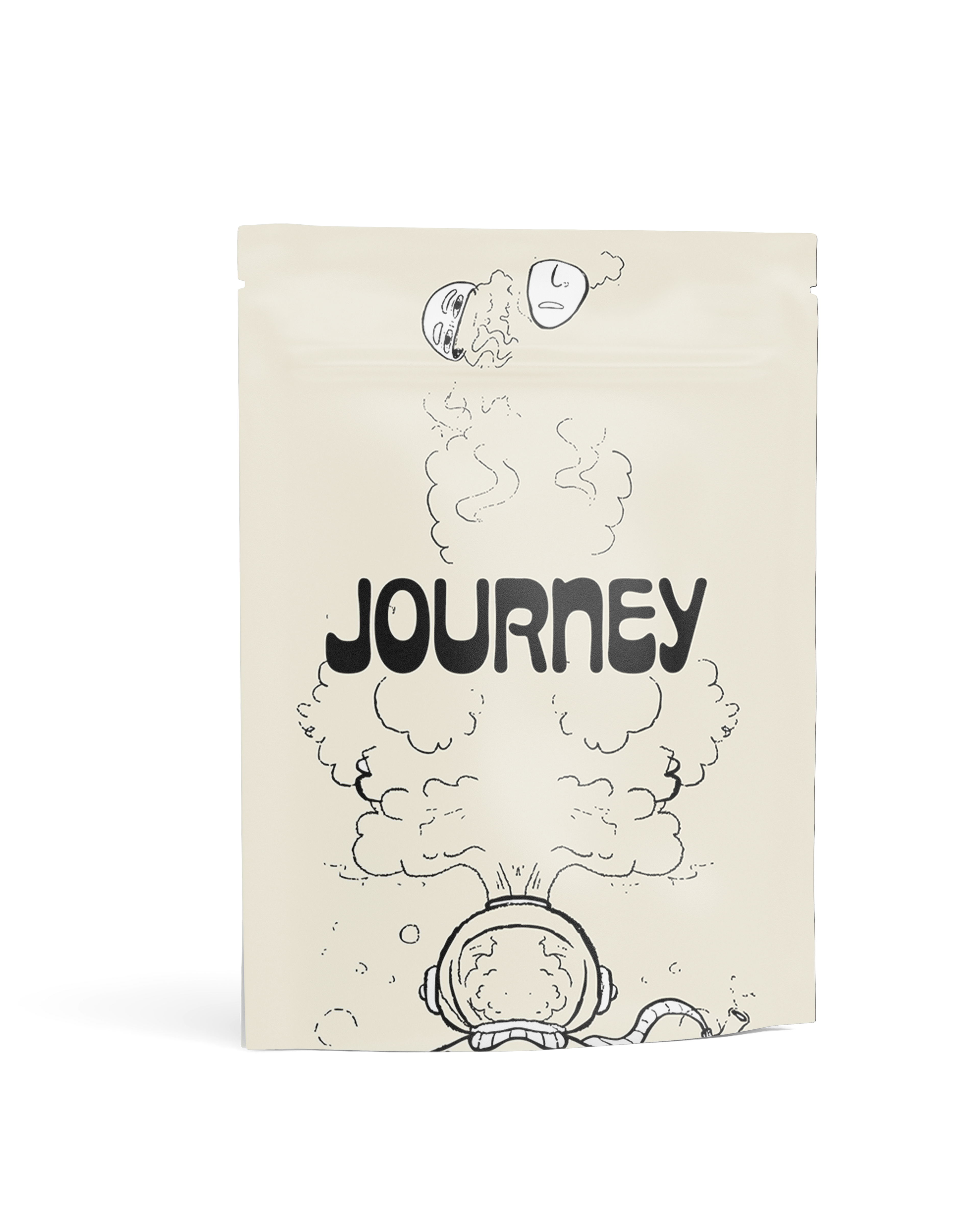
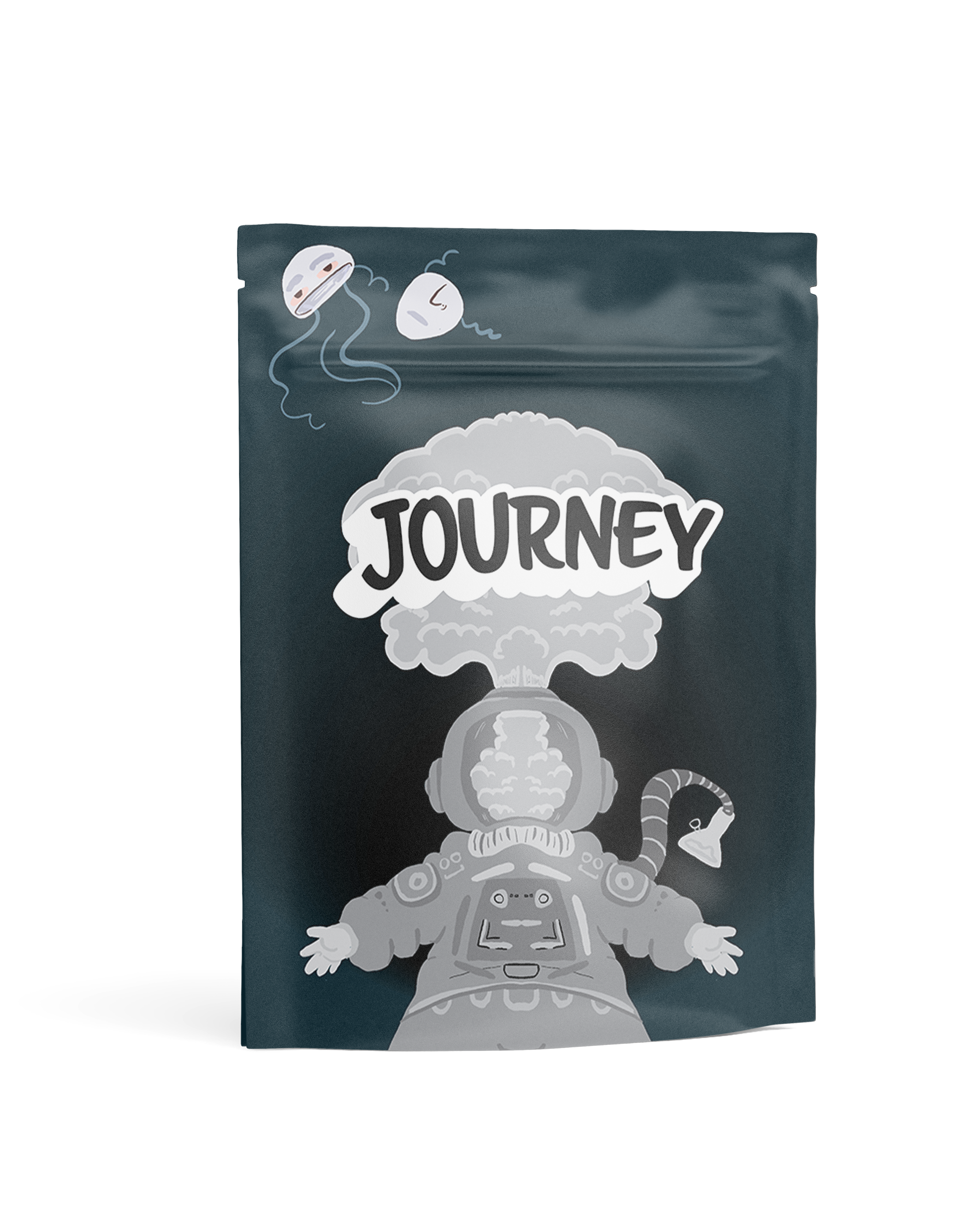
When my team and I were in the initial sketching phase, we explored different travel concepts, from space travel to a more local, sandy-beach idea. Lots of drafts and conversations were had about how close to the "Pure Options" brand we wanted to be, or whether we wanted to make it more detached.
One idea we discussed was designing them in a vintage "postcard" style. We wanted to find a way to make them more variable without redesigning the package every time.
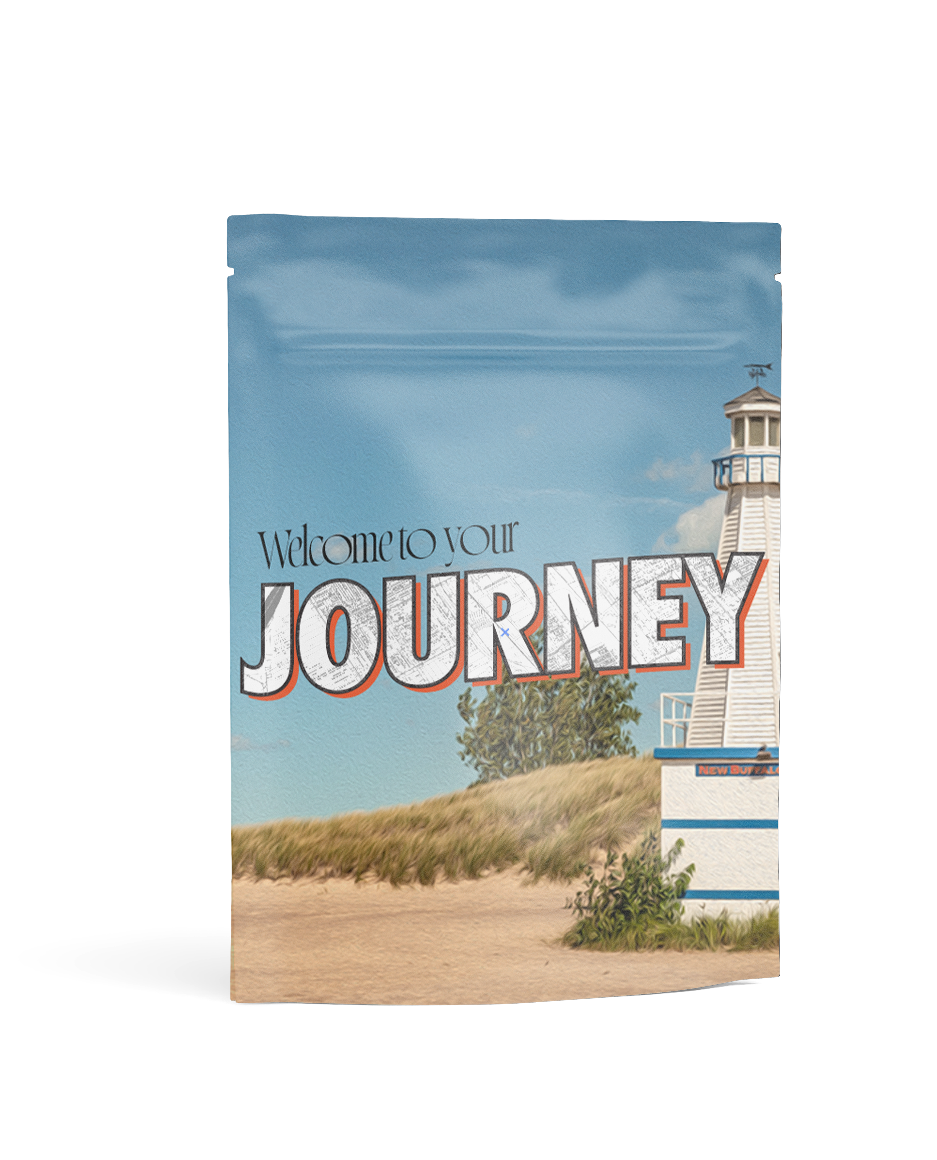
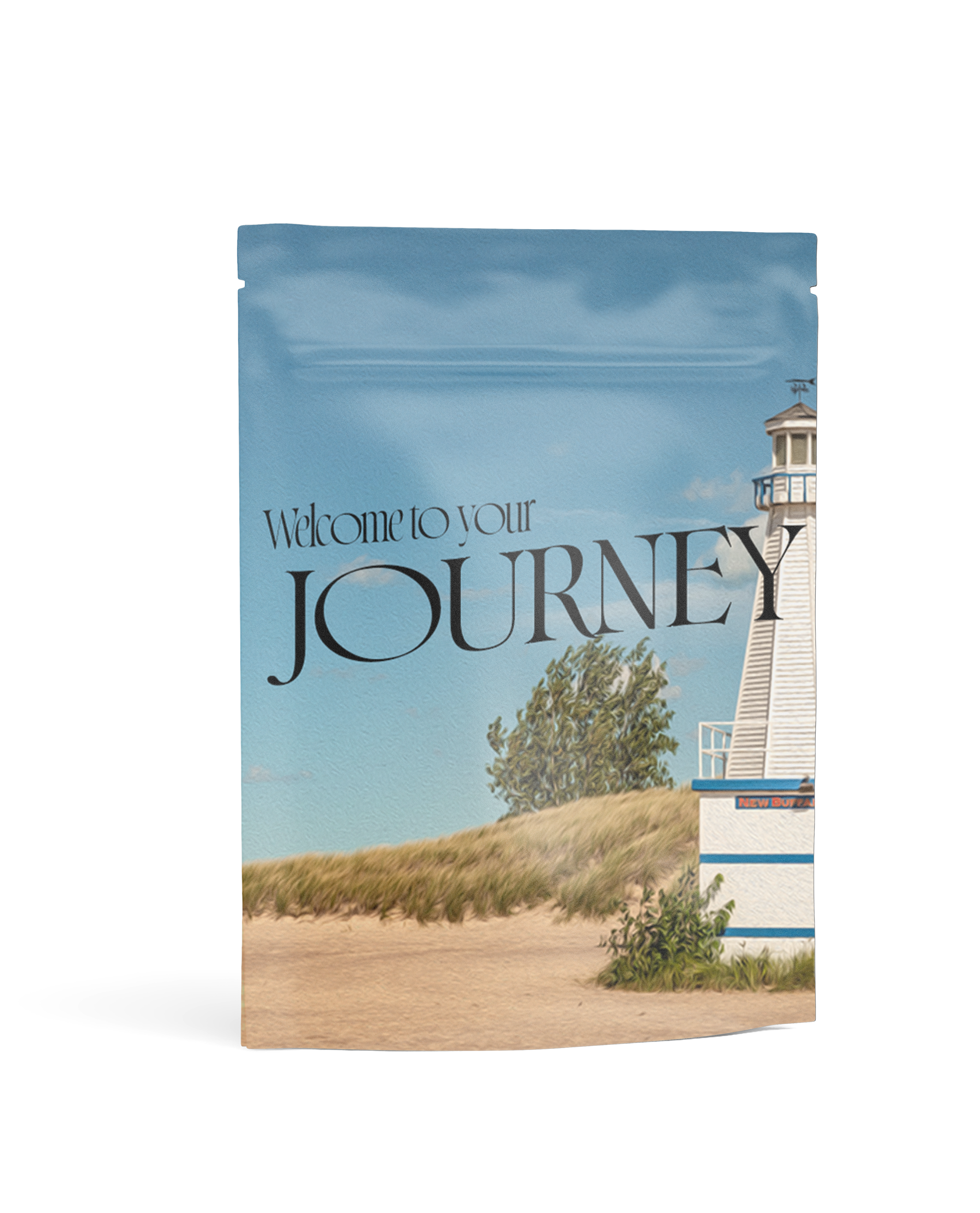
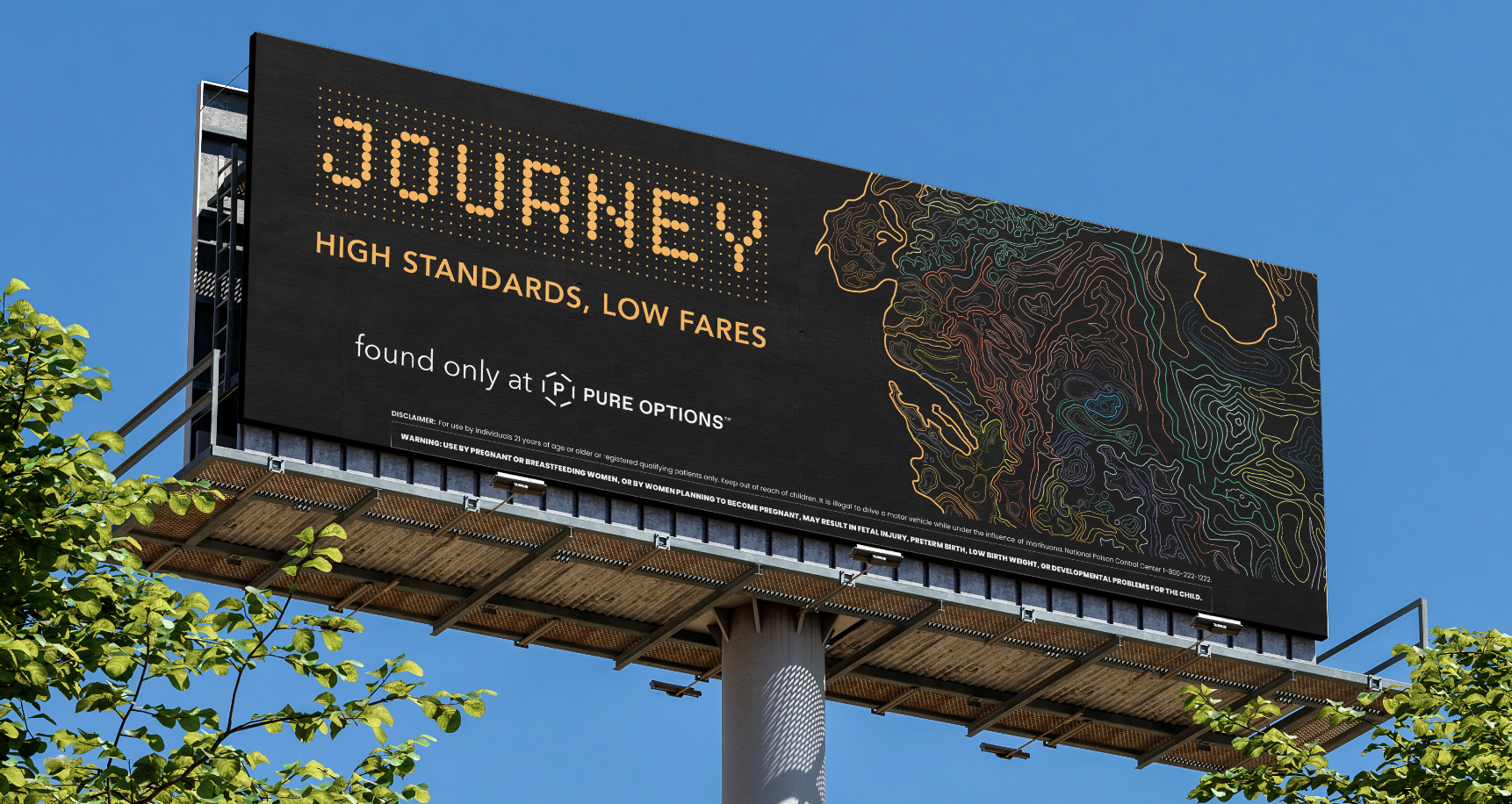
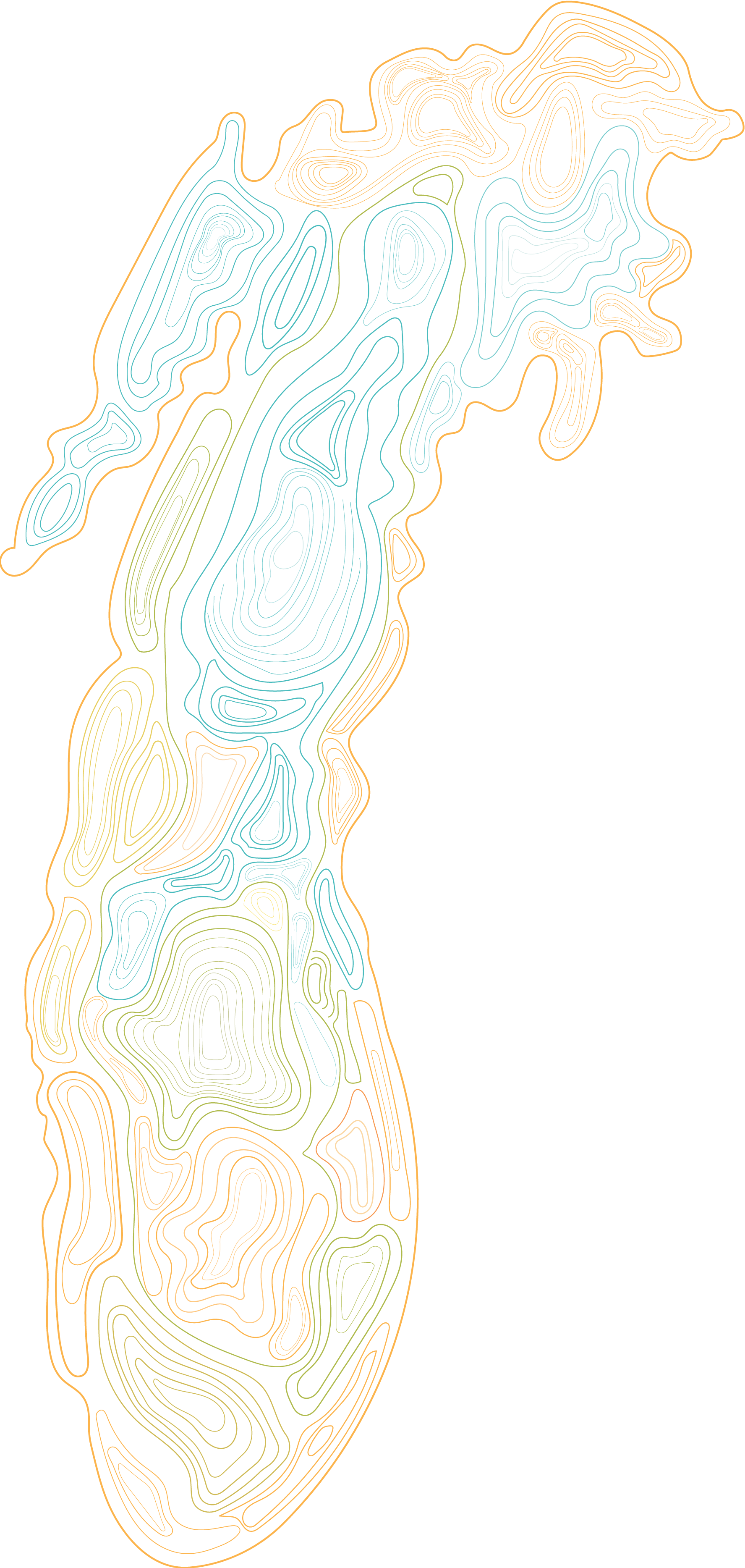
That’s how we landed on the map concept. Guided by the name “Journey,” we wanted to create an experience that felt intentional and immersive for users. We needed to strike a balance between expressiveness and creativity while also being thoughtful and functional in our color choices. Being able to change the package by rotating the map or simply adjusting the colors gave us more flexibility when labeling the products.
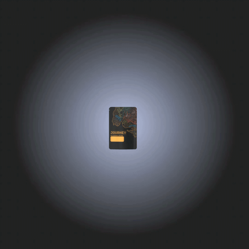
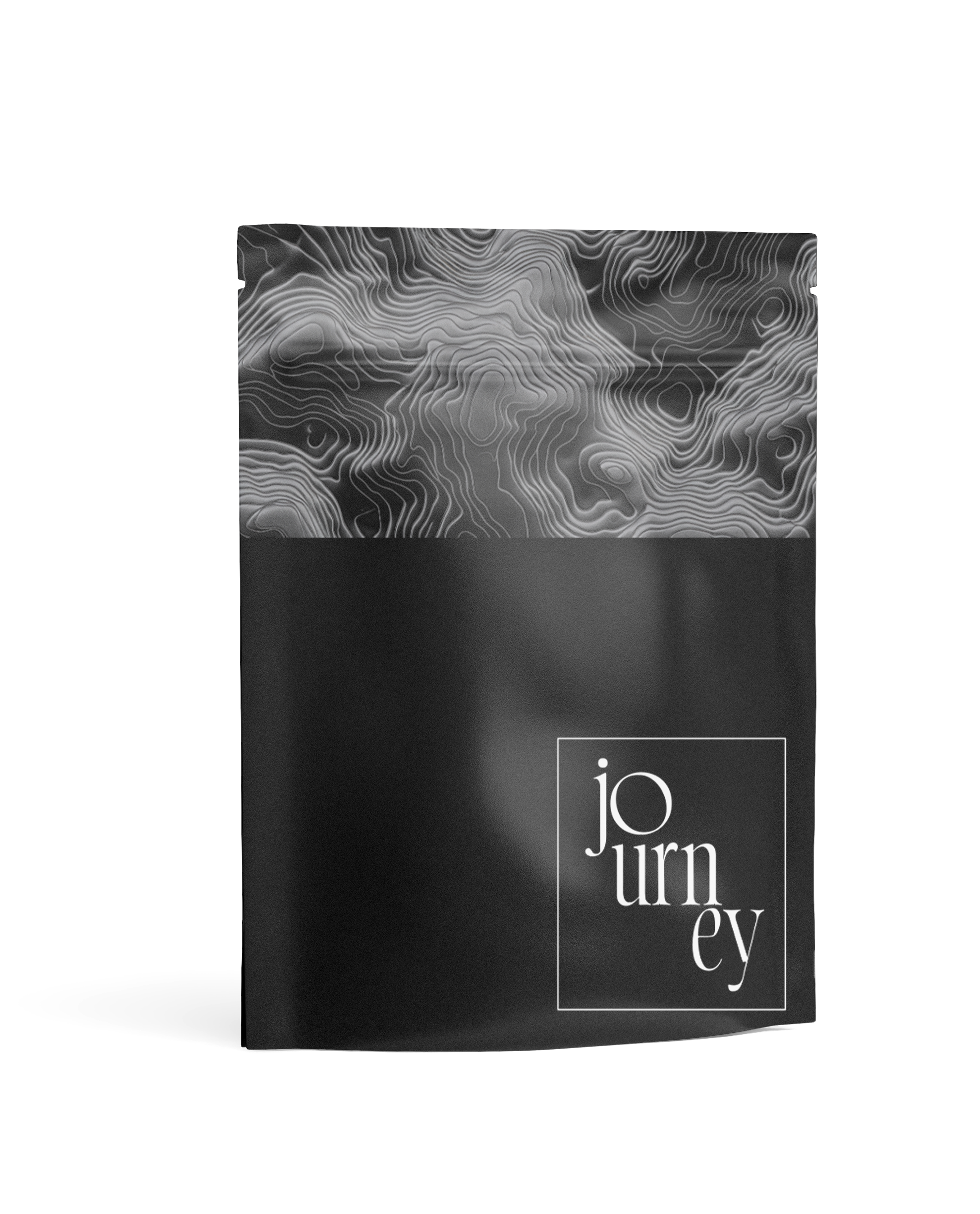
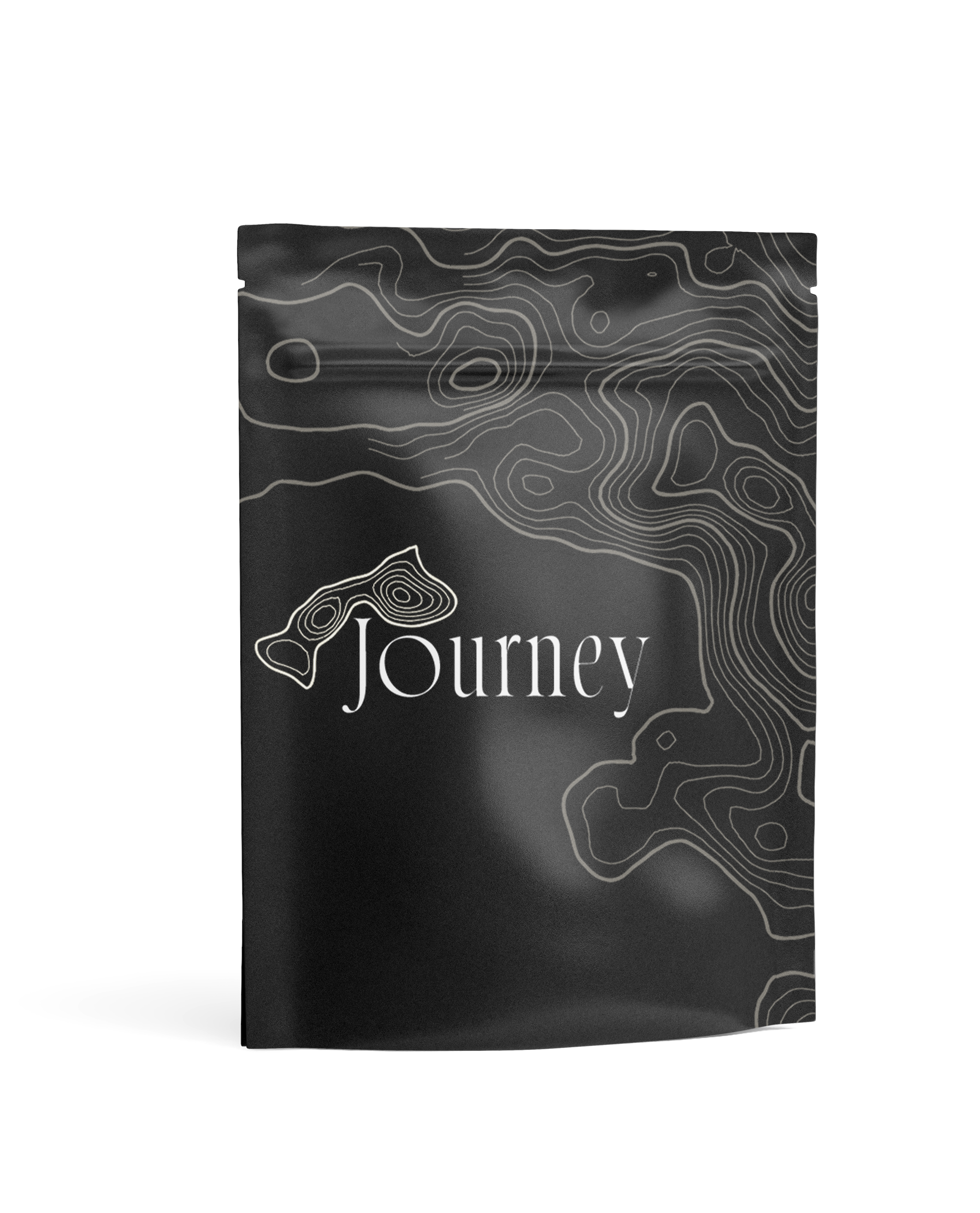
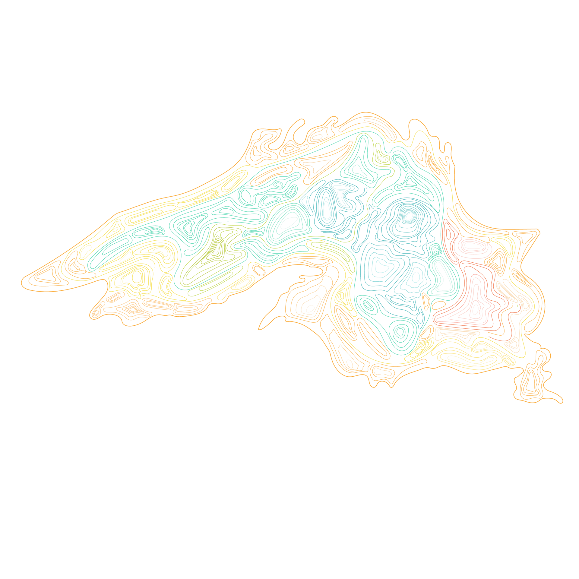
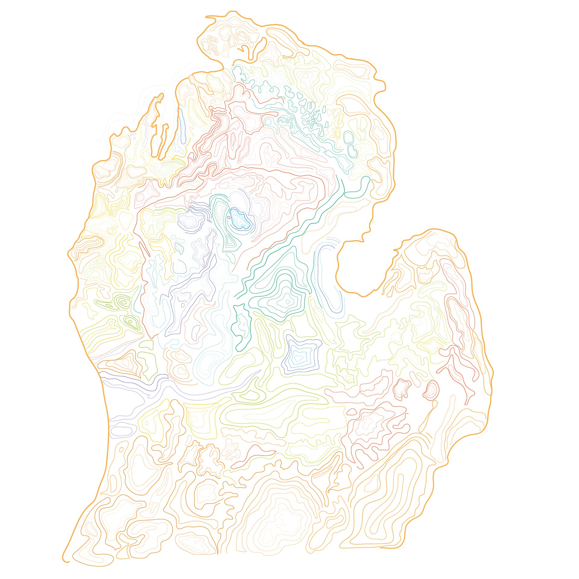
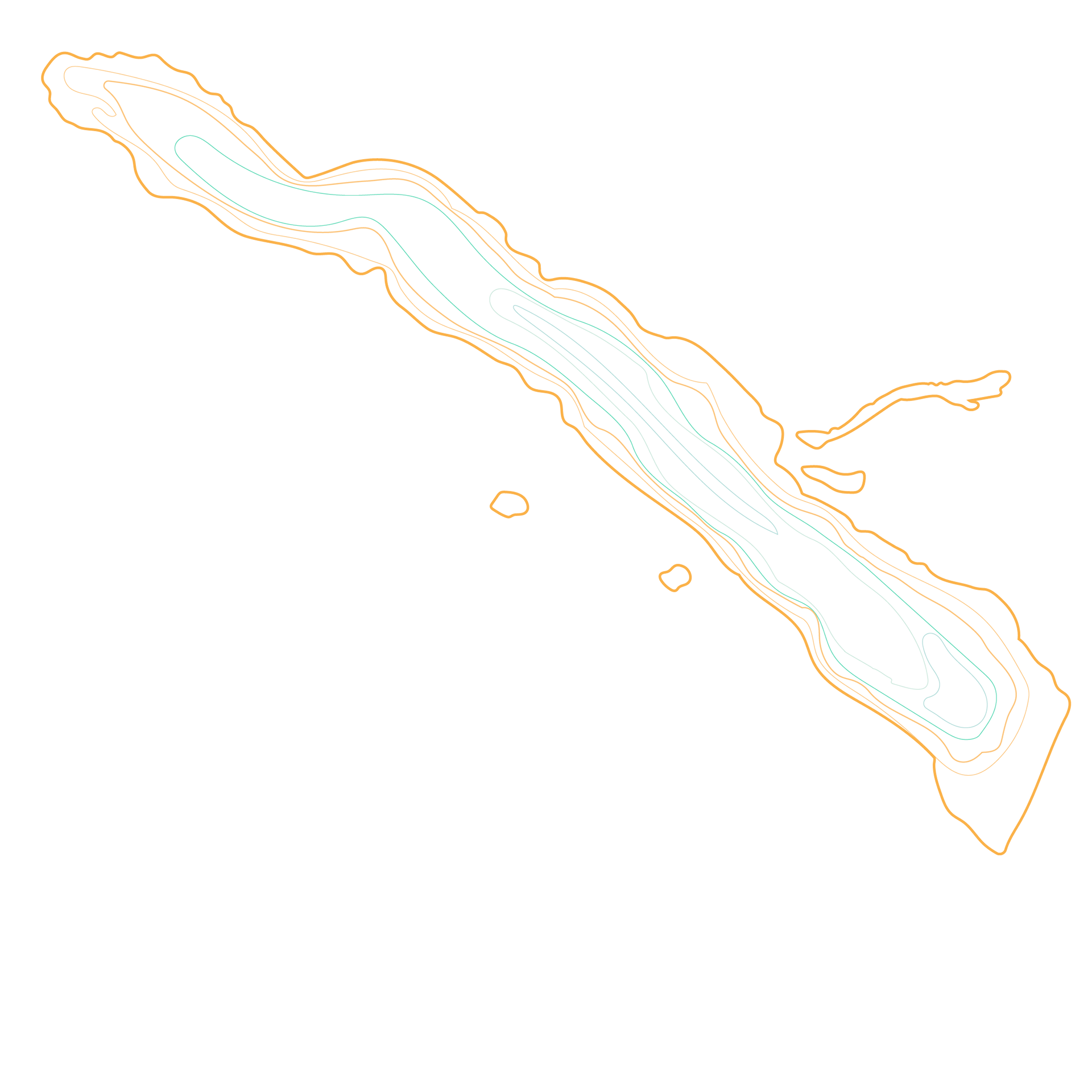
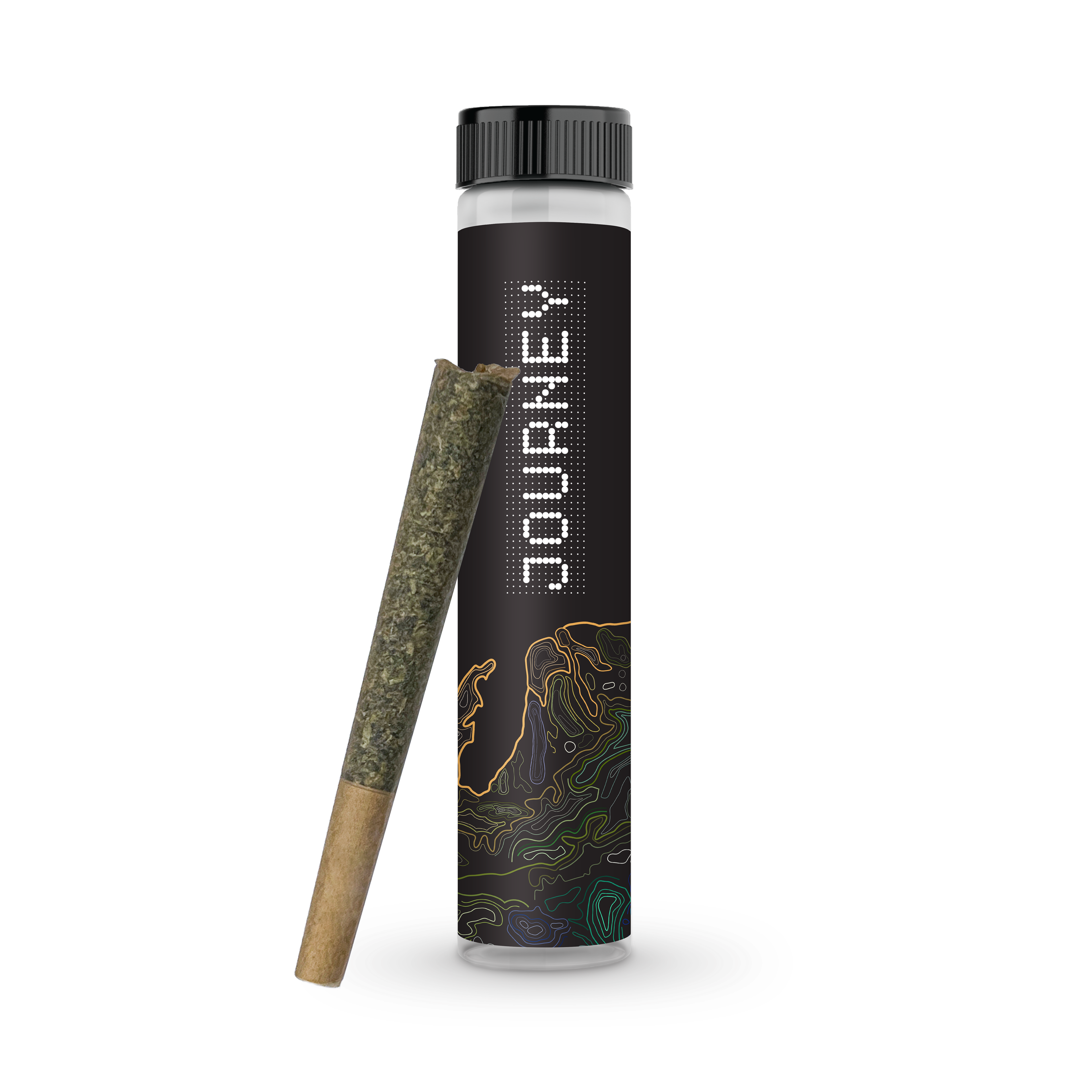
For the final design, I created a topographic map of Michigan that could be rotated for different applications. I also used “Gridlite PE Variable” as the main title font to evoke the feeling of locating a place on a map. I wanted the package to convey exploration and discovery without being too literal or relying on a traditional map aesthetic. I used yellow as a highlight color, with the remaining colors serving as accents.
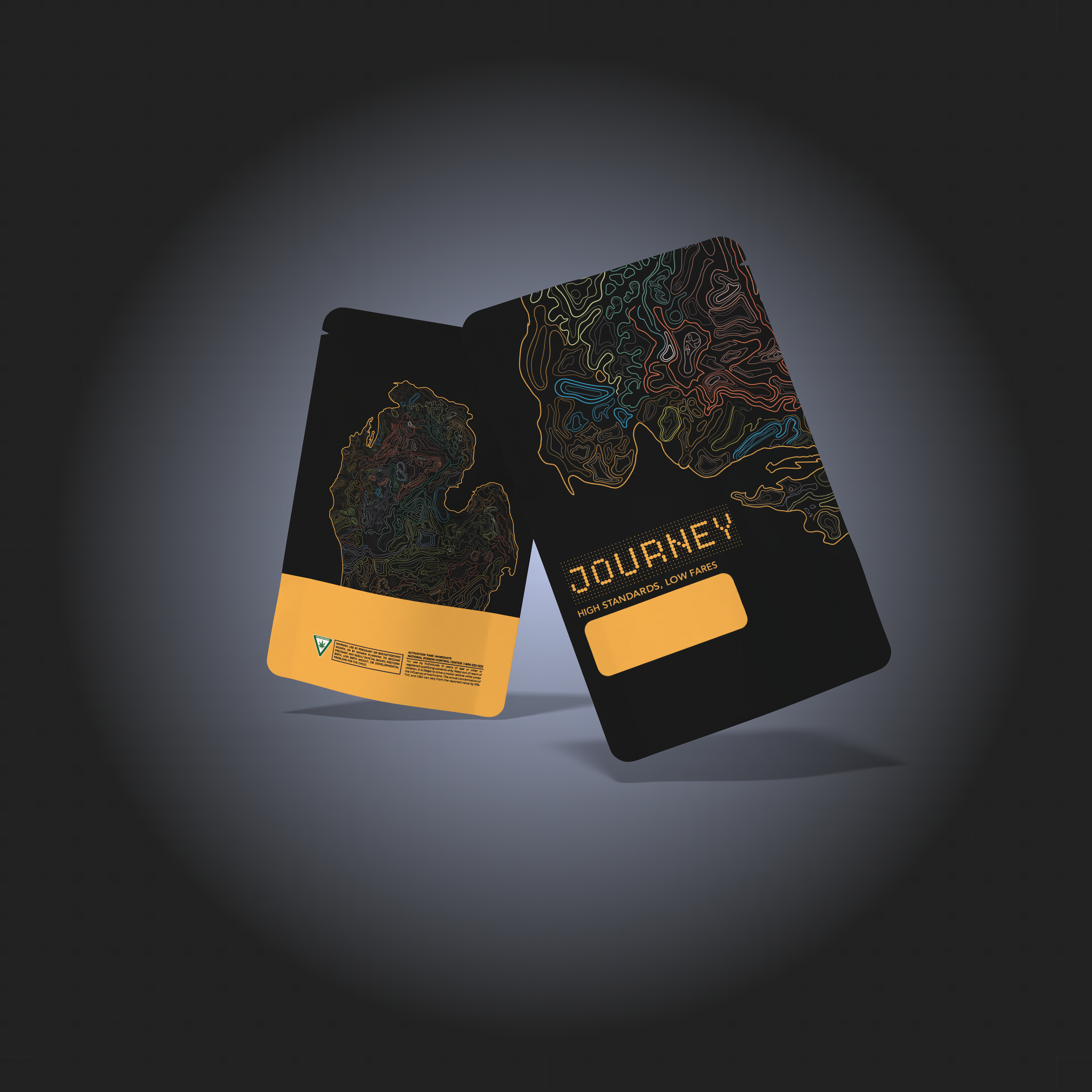
I wanted to highlight different parts of the Michigan map on each product, keeping them familiar but not too repetitive. I ended up creating separate maps of Michigan, including the Upper Peninsula and the Great Lakes, for future rollouts and product highlights. This will allow the design to remain fresh and interesting but stay on brand.
Lake Superior
Lower Peninsula- Michigan
Torch Lake- Michigan
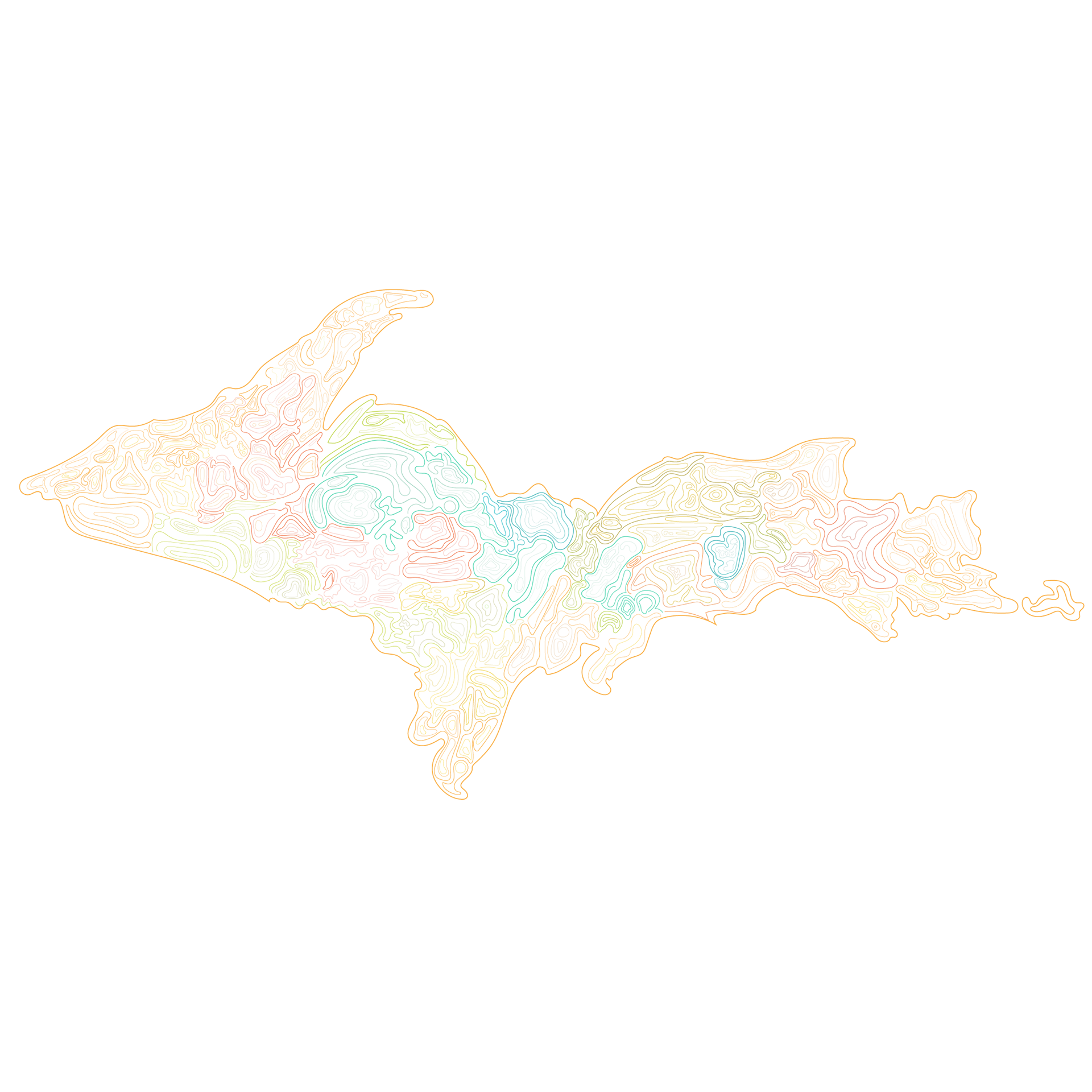
Upper Peninsula- Michigan
Lake Michigan
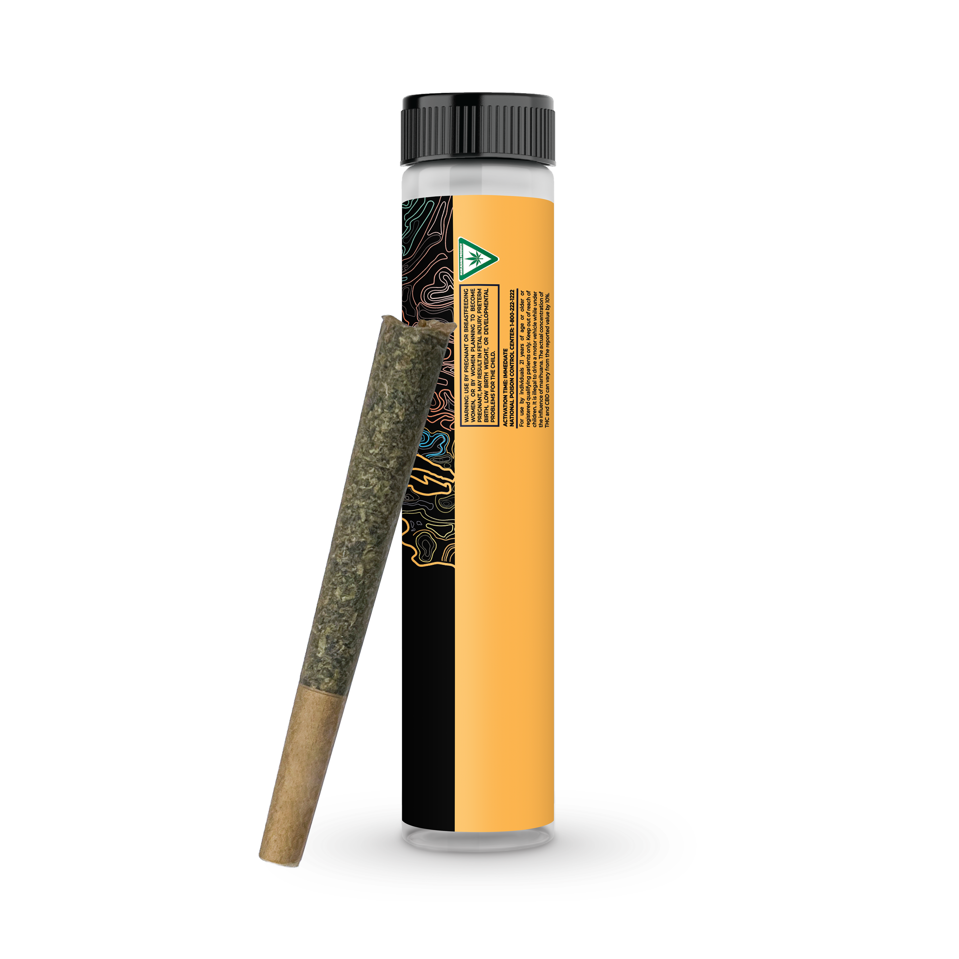
We had the chance to apply the design and branding to a variety of packages and cannabis use types. An interesting challenge was figuring out how the design would look when scaled from flat to a circular package, such as the pre-roll tube. We ended up rotating the map and adjusting the title's location to make it legible. Lots of feedback and iterations went into this phase to ensure the designs looked natural and not forced.
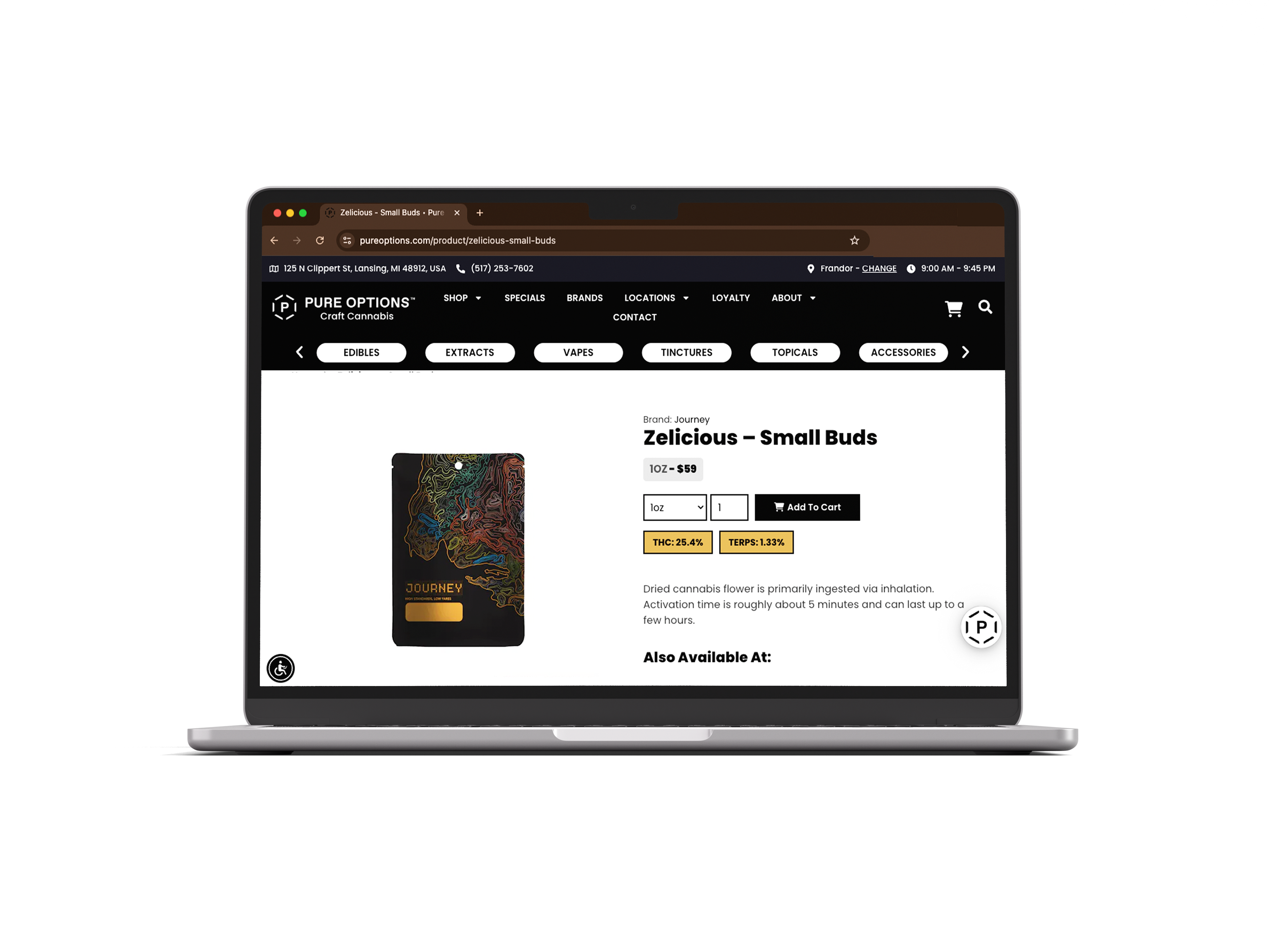
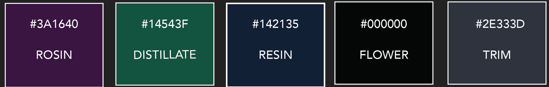
Another challenge to solve was that we had to work around the different kinds of cannabis that can come in similar packages. Within cannabis, there is Rosin, as well as Resin, both different types of concentrated waxes that need to be identified. That is when I decided to use different colors to make it easier for the cashiers to identify the different products.
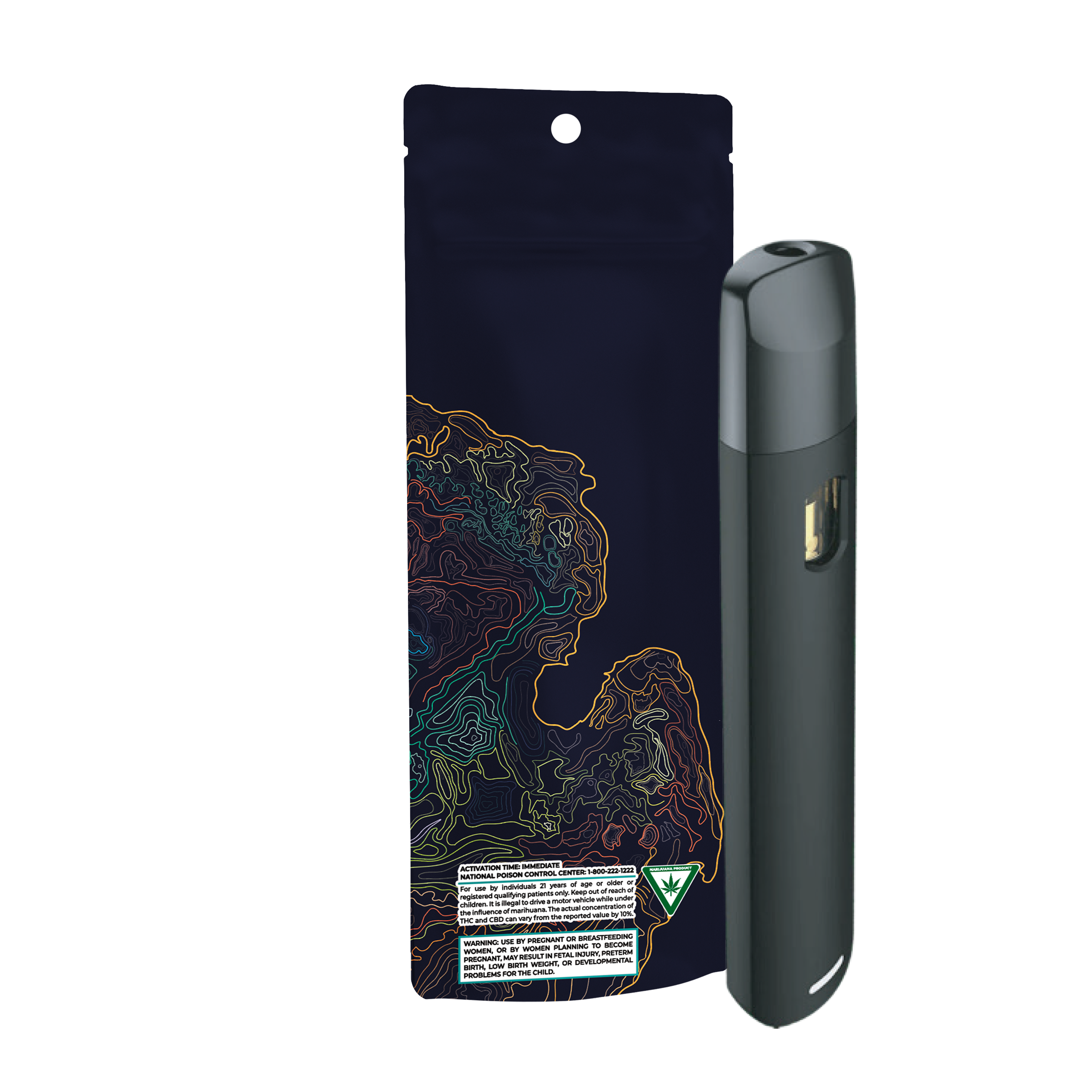
For each product, we left a large blank space for the printer to print individual product information. creation date and expiration date in accordance with the Cannabis Regulation Agency, or the CRA. Instead of the traditional manual sticker application, we can now work with the printer to have the stickers automatically placed in these areas.
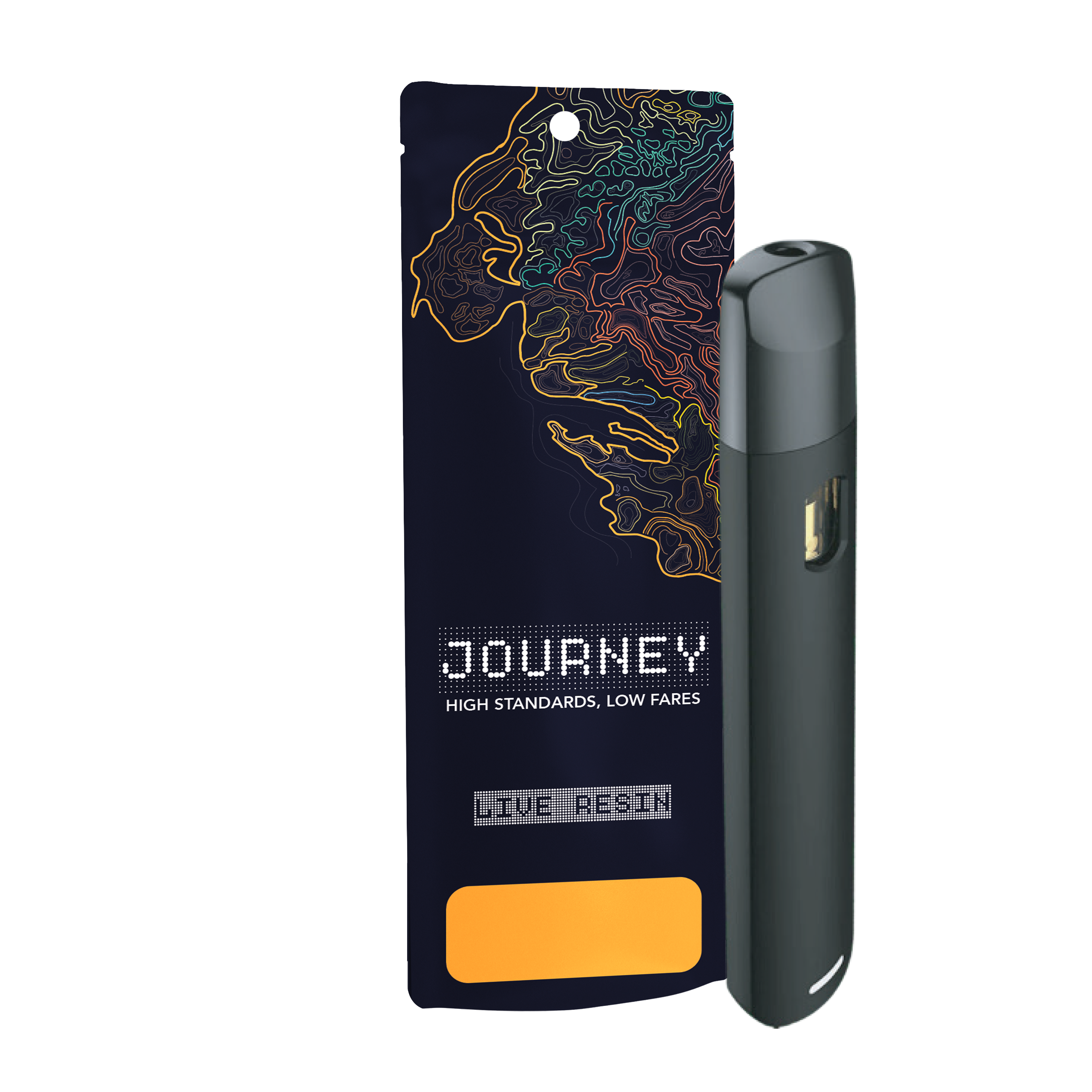
We used the tagline "high standards, low fares" to refer to lower-priced options to compete with larger competitors.
The "enjoy your journey" slogan brings a fun travel aesthetic to the design.